Overview

The following sections describe how I shoot and assemble multiple images to create a final "ghost sign" photograph. Although the examples are all about signs, I use the same methods to shoot high resolution landscapes and panoramas.
I don't consider my digital camera to be a simple camera. I consider it to be a digital imaging data acquisition device. That conceptual difference leads to the attitude that the camera is only the first step of the digital process needed to create a final image. It clearly is not what one would call a purist approach to photography, but it is a direction that I believe most high end photography will eventually go.
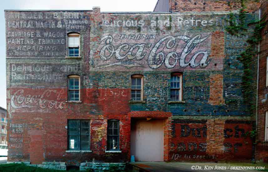
Image manipulation is not new. The photographic printing process includes steps such as dodging and burning to enhance various regions of an original photograph. People used to touch up dirt specks on negative using ink. Various color and diffusion filters are used to change the appearance of a scene. Whether the digital process is an extension of the same goal will probably be debated as long as there are cameras. I would conclude that the intent of the image manipulation may be the important factor. My intent is to reproduce the signs as accurately as possible while doing whatever is needed to make the final photography look attractive. Changing the sky from a flat gray to a blue sky with fluffy white clouds doesn't change the meaning of the sign. Removing utility poles and wires that block the sign doesn't change the meaning of the sign.
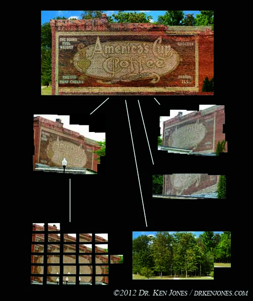
The illustration to the left is a general depiction of what I do. I shoot multiple overlapping images from one camera position, as shown in the bottom left, and mosaic them together. I repeat the process for multiple camera positions to get different parts of the sign from different vantage points, trying to ensure complete coverage if possible. All of these separate mosaics are then combined, and the background replaced. I usually can't use the original background because the warping process to rectify the signs also distorts the backgrounds too much to be usable. Also, in the case of this image, the overcast gray sky was replaced with a blue sky.
The reason for shooting so many images is to preserve resolution in the final image. Warping and distorting images, sometime several times, resamples the imaging data an reduces resolution. For that reason, I start with far more resolution that will ever been seen in the final print.
Many of the ghost signs on these pages are low resolution temporary constructions prior to my creating a high resolution final image. Usually, I would not include works in progress on my photography site. However, I am including them on these web pages because they are a useful resource, and it is useful for me to keep track of where I've been and what I've shot.
The processes can be divided into acquisition, organization, mosaicking, assembly, and final touches, each described below.
Why I Combine Multiple Photographs
I photography and mosaic multiple photographs instead of shooting a single image for one reason - increased resolution. By combining multiple photographs, I can build up the resolution to hundreds of megapixels preserving even the finest detail in the signs. Also, images frequently need a significant amount of warping and distortion because of the constraints on where I can place my cameras. I need the additional resolution to preserve detail throughout the digital warping process. My goal is to have a result that looks like the sign is photography "straight on" with the minimum amount of foreground clutter, while preserving the fine details in the sign.
My Nikon D300's have 12 megapixel DX sensors. I'd like to be using a 60 megapixel Hasselblad, but they are very expensive, and also they are not really meant to be field cameras in the way I shoot signs. My cameras, while not cheap, are at least not a total tragedy if one breaks.
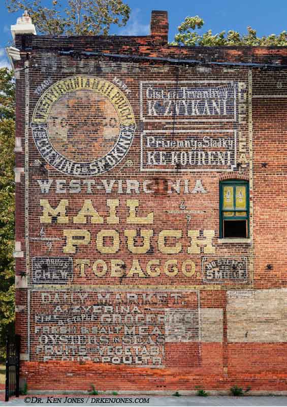
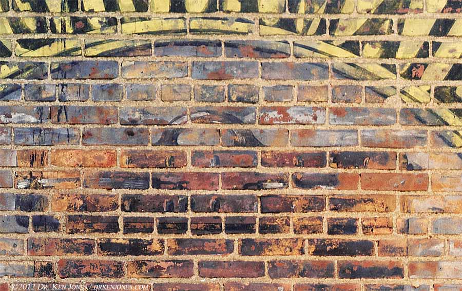
Let's start with an example of the detail in signs. This detail is lost unless I shoot at a higher resolution that my cameras can acquire in a single image. For example, the detail of the handle of the mail pouch in this beautiful sign in Cleveland is preserved with the high resolution results. Even though this part of the sign is almost two stories above the ground and not really visible, the sign painter took the time to make this, in its own way, an original work of art. The detail of the brush strokes are visible in the higher resolution. These signs are not paint-by-the-number.
 The second reason I need the additional resolution is to handle the rectification process of the signs. I found with the first sign I shot
that it looked much more professional if it appears as if I shot it perpendicular to the frame. Because there is a loss of resolution when images are
distorted, I need shoot more resolution than is needed in the final print.
The second reason I need the additional resolution is to handle the rectification process of the signs. I found with the first sign I shot
that it looked much more professional if it appears as if I shot it perpendicular to the frame. Because there is a loss of resolution when images are
distorted, I need shoot more resolution than is needed in the final print.
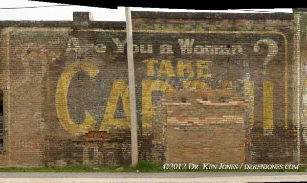
A third reason, made possible with the higher resolution and ability to rectify images, is the removal of foreground clutter blocking signs. This Cardui sign in Prescott, Arkansas, has a single utility pole nicely placed in the center of the sign.
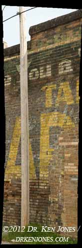
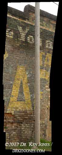
How does one get the information behind the pole? Simple. Just shift the camera position and shoot behind the pole. I usually shoot from both sides just to be sure I have coverage. Because the images need to be warped to the same geometry as the main sign, I need a higher resolution to ensure that these patches don't become visually soft. Each of these photos is comprised of six overlapping 12 megapixel images.
The above two images are rectified to match the master shot, and combined to create a final image without the pole. The method for combining images is described in the Assembly section below.
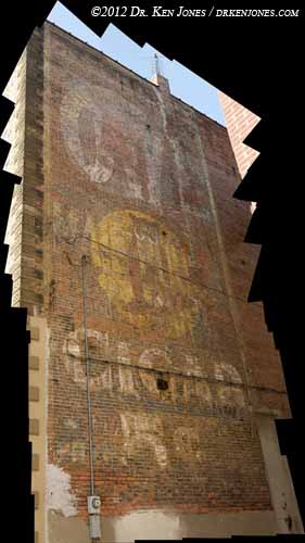
As a final extreme example, the following wide shots are from Columbus, Mississippi. The sign is great, the park around it is great, but photographing the sign with all of the trees and shrubs and structures is a challenge. Each shot is closer to the sign. The closest, at the bottom, has been rectified to match the wall perspective of the other shots. However, I am shooting up at more than 45 degrees to include the top of the signs.
The top image would be the ideal position to shoot the sign - from a distance to minimize distortions. However, there is a problem - TREES!
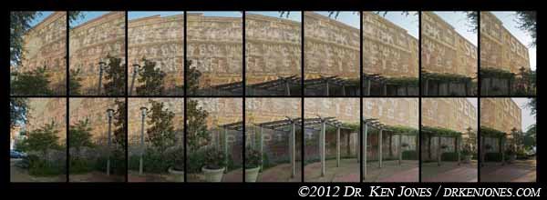
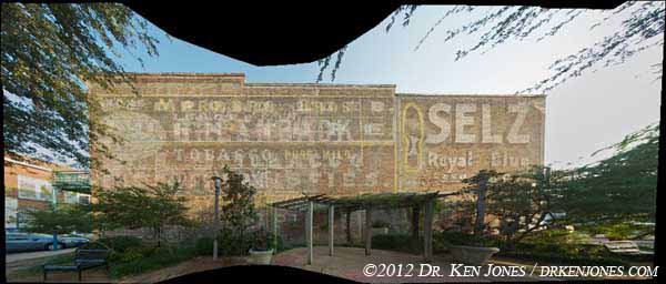
When I am close enough to avoid the overhanging branches of the trees, I am shooting up at a fairly steep angle - over 45 degrees qngle up and to the sides. The result is that the resolution differences between the closest and farthest parts of the sign will be clearly noticable in the final shot if it is digitally rectified afterwards. The individual photographs used to make this single image of the sign show the amount of perspective correction needed. The amount of stretching needed for the perspective correction is apparent by what happens to the leaves on the overhanging branches.
I end up shooting different camera positions using different lenses. Some are shot with as long as 400mm, some are shot with a as short as 12mm. These must be combined to appear to be the same resolution. Again, higher resolution gives me the control I need over the resolution of the final mosaicked image.
Acquisition
My cameras are Nikon D300's. These cameras are nice and rugged. I prefer these cameras because there is a "mirror up" shooting mode - the first shutter release raises the mirror, and next shutter release actually takes the photo. By waiting a couple of seconds, camera shaking is eliminated. Even though I have a solid tripod, I sometimes shoot in low light conditions, and sometimes I use my 600mm lens with a 2x tele-extender. In both cases shaking is a problem. I always use an electronic shutter release so I don't have to touch the camera.
I primarily use the Nikon 80-400mm zoom, followed by the Nikon 24-120mm, and the Nikon 12-24mm in confined spaces.
I shoot a series of photos from multiple camera positions. Ideally, I would shoot from a single straight-on camera location as far away as practical to minimize distortion and have a single high-resolution result.
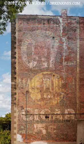
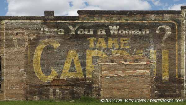
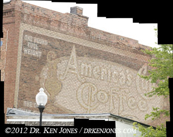
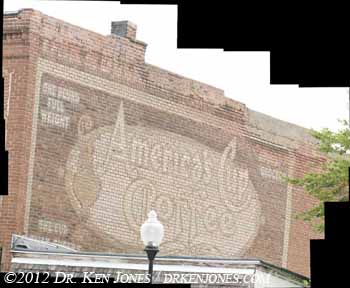
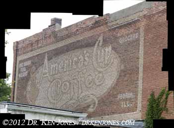
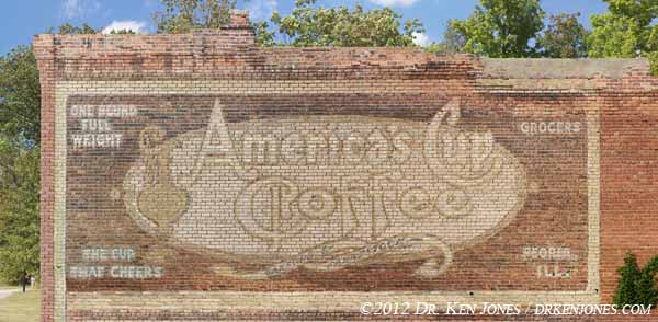
However, in the real world, that happens about one-quarter of the time. Usually there is something blocking part of the sign from view, or the shooting space is confined. The major culprets include utility poles, wires, trees, and other buildings. The America's Cup Coffee sign to the left was blocked by a tree, an adjoining building, and a light post.

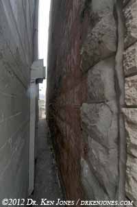
Many signs are located down narrow alleys limiting the distance I can be back from the sign.
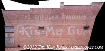
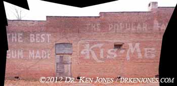
I photograph the sign from various positions along the alley. These two examples are centered on the large 'M' and on the large "K". East of these is, of course, a mosaic of multiple images.
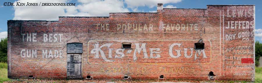
For the final image, the positions along the alley are joined together. I use the sharpest part of each image during the assembly.
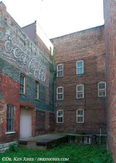
This Coca Cola sign in Burlington, Iowa, is situated in a gap between buildings. I shot from several locations space along the length of the sign, but always looking "up" at the sign.
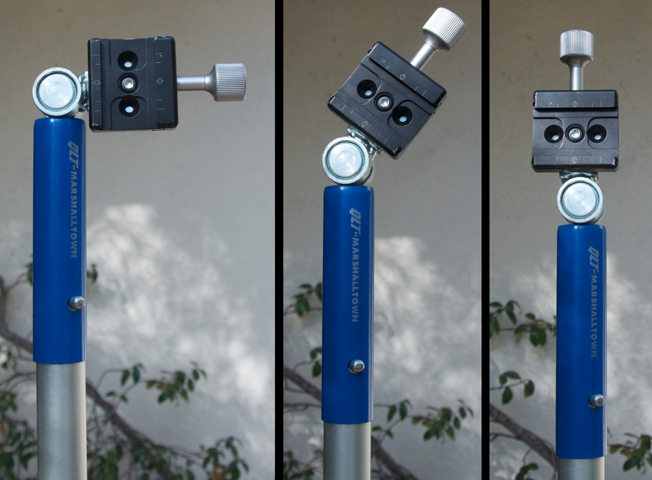
Some alleys are even narrower. In order to photograph the higher parts of these signs, I constructed a pole support for my cameras. In these narrow spaces, I am supporting a D300 with the 12-24mm lens. I originally tried PVC pipe, but found that even larger diameters would flex too much. I couldn't find any sort of telescoping pole that could support the weight of the camera. I eventually found poles used to support painter's brushes at Home Depot. They are aluminum and can be joined together. To attach the camera to the pole, I use a simple screw mount from Really Right Stuff. I use the screw knob instead of the quick release so I don't actually hit the camera against a wall and activate the quick release.
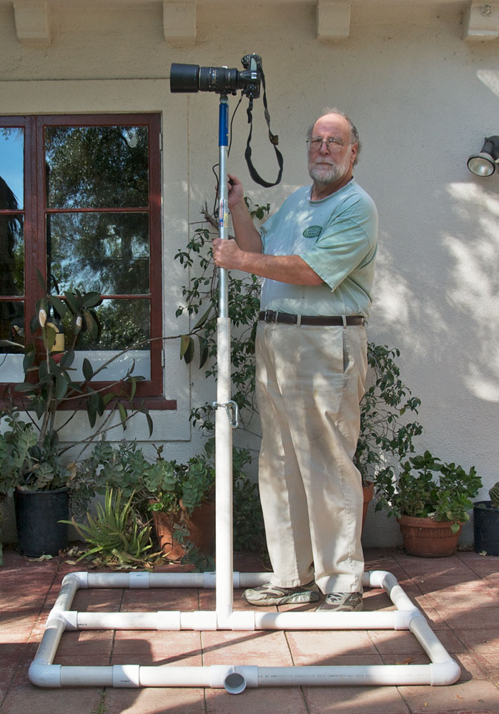
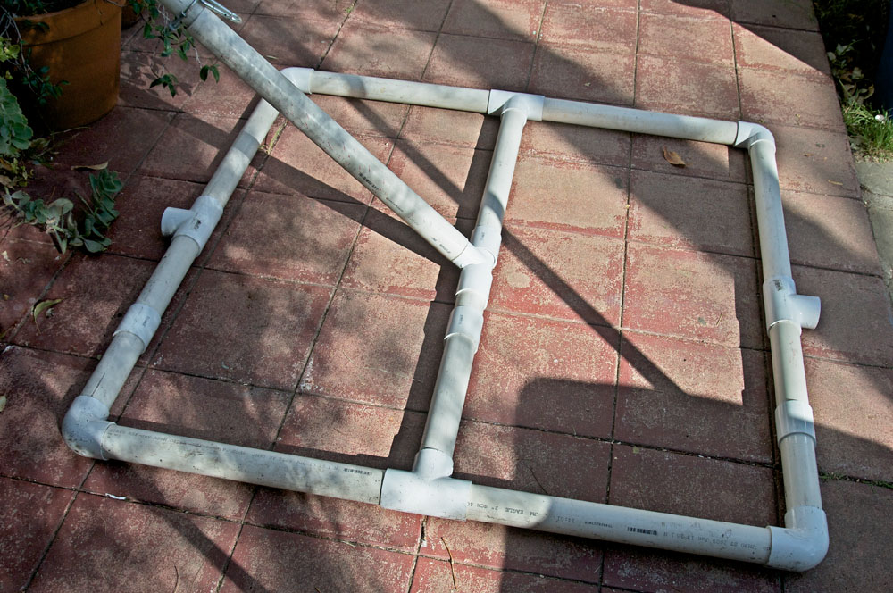
I find that I can lift the cameras when the poles are around 12' high, but higher requires a fixed pivot point on the ground so I can "walk" the pole up starting at the camera end. I constructed a low cost solution out of PVC pipes that I can carry in my old Aerostar Van. I keep it from sliding on the ground, or toppling, by using three 25 pound sand bags. It takes about five minutes to setup. I also put out orange warning cones to make sure that I am visible. I only set this device up when I have a spot clear of overhead wires, and also is away from any pedestrian or vehicular traffic.
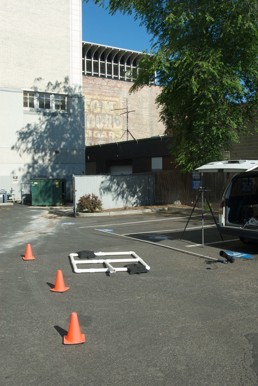
When I need to get higher, or when I am shooting with a telephoto lens, I need additional support. After several tries, I came up with a stable platform that is lightweight and can be transported in my van. A support base that provides a pivot point for the pole itself is made of PVC pipe. There is a main frame with internal pieces that let the pole pivot around a fixed point on the base. I always use sandbags to keep the base from sliding on the ground. I also put out orange cones around the workspace. I pick a location that is away from powerwires or foot traffic. Safety first.
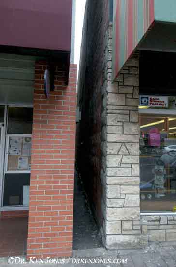
Some signs are situated between even narrower spaces, such as the one in Ashland, Oregon.
A 12mm focal length just gets a small portion of the sign. I didn't even know what the sign said until I put the pieces together later.
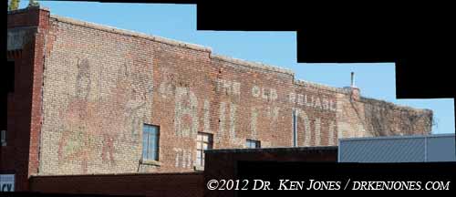
I also use the pole support to photograph over the edges of buildings. This Bull Durham sign in Princeton, Missouri, is blocked by a rise in the front of the adjoining building.
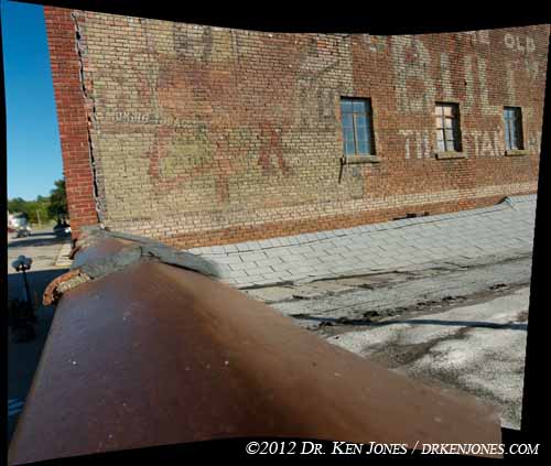
When I lifted the camera about 20 feet above the ground and just over the rim of the building, I was able to photograph the area at the bottom of the sign.
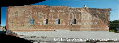
Shooting a series of photographs from that position, I obtained coverage of almost the entire sign. I usually shoot everything I can without the pole rig, and then fill in the pieces with the rig.
Organization
I use Aperture to organize my photos. I am not going to get into the Aperture vs. Lightroom arguments - Aperture does what I need it to do. I currently have around 200,000 separate images just for ghost signs.
I assign the name of the city and state to each of the images using the keywords.
When I first started shooting signs, I quickly discovered that, when I loaded the images into Aperture, all the pictures of bricks look exactly the same. Sequences from multiple camera positions looked absolutely identical and I could not find the "break" between sequences. I also couldn't locate the breaks between signs in different towns. (Also, I couldn't remember what towns I had visited during the day)
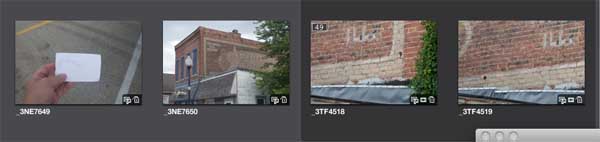
Now, when I arrive in the next town, I first shoot a 3" x 5" card with the name of the town. I could use a GPS, but a slate is quick and easy, and becomes a nice visual cue in the endless images of bricks.
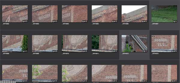 I also shoot 'junk' frames between camera positions so I can distinguish the breaks between setups.
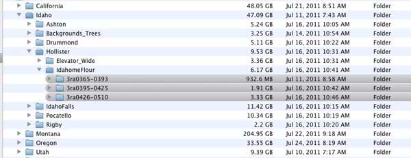
When all of the images are organized, 'stacked', and color corrected if needed, I export them as .tiff files into a series of folders organized using the same grouping as I set up in Aperture. All of the groups of images associated with a single sign are collected in a single folder for that sign, inside a folder for its city, and inside a folder for its state.
Mosaicking
Now comes the fun stuff - putting all of the individual pictures into a single final image.
As is usual with software, one single piece of software does not do it all - even Photoshop. Each has its unique advantages and limitations, so combining the capabilities of separate programs is required.
I have devised a workflow that uses three main pieces of mosaicking/montage/stitching software. These are DualAlign's i2kAlign, Autodesk's Stitcher Unlimited 2009, and Adobe Photoshop CS5. I am using the previous version of i2kAlign, version 1.3.7. All of these are being run on Apple Macintosh machines.
There are two reasons I don't use Photoshop for the first step of mosaicking individual frames.
First, it seems to handle no more than around thirty-five images before it chokes. This doesn't seem to depend upon the amount of memory or disk space - I believe it is an algorithmic issue on how it compares the photos prior to the mosaicking process. I get the same result on my older Powerbook Pro with 3 gigs of memory, or on my Mac Pro desktop with 32 gigs of memory.
The second issue is the way it calculates mosaics using a perspective projection - that is, where all straight lines are supposed to remain straight like in a taking camera. I find that the lines have a slight curve to them. There aren't really any options for fine-tuning the way it does the calculations.
Where Photoshop is invaluable is combining the prebuilt mosaics from the different camera positions, described below in the Assembly section. Unlike Stitcher and i2kAlign, both of which assume that all images are take with the same lens and from a single camera position, Photoshop can successfully align images with widely varying positions and scale. I will discuss this below in the Assembly section
It also is the best for the final blending of images. The "Auto-Blend Layers" does magical (in the good sense) things.
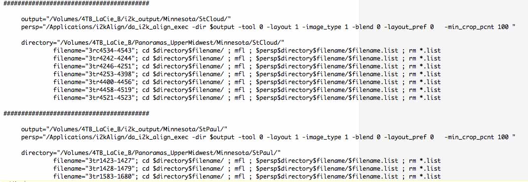
My first pass on all images is to use the i2kAlign software. It has a mode that allows me to run everything through in batch mode. i2kAlign does have a graphical interface, but to me the real power is the batch mode. I wrote some code to generate a unix shell script from the individually sorted image folders described above. I let this process run on a separate Mac-mini connected to the server. I frequently run two separate instantiations of the script because i2kAlign does a good job of both memory and disk scratch space management.
Since the processing is completely automatic, it doesn't get everything correct. However, for around 80% of the mosaics I give it, it succeeds. It correctly preserves the straight lines in the perspective mode. The limitations in the way I use the program is that it takes progressively longer to run when more images are added. I find it useful up to around 80 images. There is a newer version of the software available which may address that issue, but it became much more expensive.
 I first define a unix command 'mfl' that goes into the bin directory. When one cd's into a directory, and executes mfl, it makes
a file that contains a list of the .tif or .tiff images that are in that directory. This input is needed for
the batch version of i2kAlign.
I first define a unix command 'mfl' that goes into the bin directory. When one cd's into a directory, and executes mfl, it makes
a file that contains a list of the .tif or .tiff images that are in that directory. This input is needed for
the batch version of i2kAlign.
I then run a program (which I wrote) that analyzes the file structure containing the files to be processed, and generates another executable
file that runs through all of the directories and drops the results into new directories with the same structure as the input.
About eighty percent of the output of i2k works correctly. It has some geometric issues with angles that are too wide. It also blends images so that double images are visible in some of the results. However, these are usually only a few pixels in separation which is small compared to the large mosaics. It also works better with longer lenses. It also seems to have a practical limit of somewhat over 90 images - only because it takes a long time to stitch the images. It uses multiple processors and memory very efficiently so that it is the fastest solution for mosaicking my photos, as long as I stay less than around 90 images.
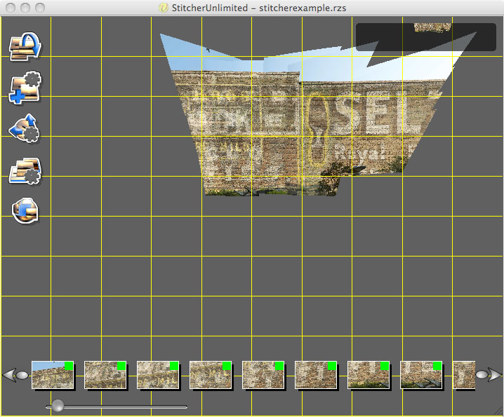
I use AutoDesk Stitcher when I have images that are shot with wider lenses - like in the confined spaces above - or when there are over around ninety images. It stitches the frames together faster than either Photoshop or i2kAlign. The results can be moved around interactively to obtain the best final projection. It uses real projective geometry based on the lenses to create a true planar result.
Stitcher is primarily designed for generating interactive VR panoramas, for which is it extremely good. Stitcher assumes that all images are the same focal length (or very close) and shot from a single camera position. The best results are obtained when I use a fixed focal length lens instead of a zoom, and use a nodal point camera head. However, it's rendering process is very slow. It's blending of the images is good only when the above geometric shooting conditions are met.
Stitcher is an older program that was purchased by AutoDesk from RealViz. It has not been updated to use either multiple processors or 64 bit machines. While this seemed like a problem. I found that it works to my advantage. With a multi-processor machine, I can set off multiple instantiations on the same machine at the same time. Each process uses its own processor and it's own 2gig chuck of memory, and do their calculations away interference with the others. The maximum I run are four at a time, not because of machine constraints, but I become confused trying to manage all of the processes. I am usually running Photoshop at the same time.
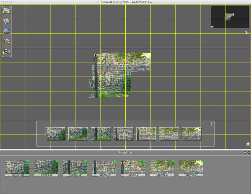
Stitcher has two features that are indepensible for some mosaics. The first step is loading images into the GUI interface by dragging them from a folder. The program does an automatic stitch of the images. Stitcher seems to handle very large numbers of images much faster than either i2kAlign or Photoshop. It can assemble several hundred images in about two hours. Since the program uses only a single processor at a time, it's speed depends on the speed of a single core or processor chip rather than multi-processing. It runs almost as fast on my Mac-Mini as it does on my Mac-Pro. (I have multiple licenses, by the way, one for each machine.)
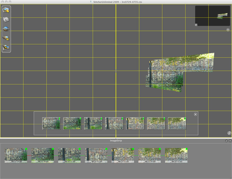
The second feature that I use is to interactively distort the resulting stitched images. The program uses the correct projective geometry to create a planar projection that preserves straight lines. In the image to the left, I have dragged the mosaic to make all of the bricks to be horizontal. Photoshop and i2kAlign do this on their own. Photoshop seems to have a small bending to the results instead of a true horizontal line. i2kAlign preserves the straight lines, but ends up in a skewed image.
The downside of Stitcher is the rendering engine. It takes a very long time, and will terminate if it tries to render too many images. The blending operation is slow, and unless the original images are shot with a true nodal point and minimal lens warp, there are residual double images in the overlaps. In fairness, Stitcher is primarily designed for VR panoramas which it does very well. When one shoots VR panoramas, it is basically a given that one is using a nodal point camera device and probably a fixed focal length lens. When I do that, the results are basically perfect. However, since many of my fragments of signs are shot in very confined spaces, I need to do some additional processing in Photoshop to blend the images. There is an option in Stitcher to render the result in a Photoshop format, but that takes even longer.
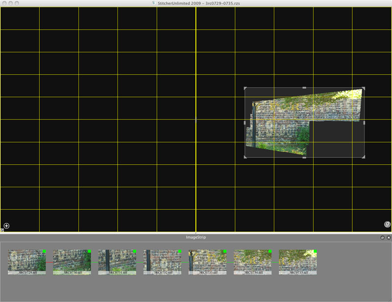
After the images are aligned and positioned to the proper perspective, I select the are to render so that it just contains imaging data.
Instead, I use an option in Stitcher to render and save each image separately to individual files. The rendering goes pretty quickly, faster than the stitcher process, and uses much less memory since only a single images is processed at a time.
What is useful is that each image is rendered in a larger image that is consistent with all of the individual frames. Each image is in its proper position ready to be blended in Photoshop.
The images are then loaded into Photoshop using "Scripts/Load File into Stack...". When they are loaded, they fall in the correct locations since they are already projected and placed in the correct positions in Stitcher. Since Stitcher renders each shot as a layer instead of a background, the regions around the image are visible.
One final step is to add a black background, and flatten the image. The reason for this black background is discussed in the assembly step below.
Assembly
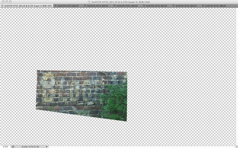
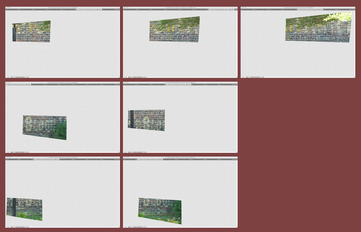
The next step is the assembly of the pre-mosaicked images from the different camera positions. This step is where Photoshop is indispensible.
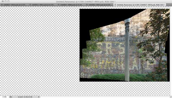
I use the "Load Files into Stack" script available with Photoshop. I then use the "Auto-Align" feature. The images to the left show the various layers added on top of each other after Photoshop has aligned them. There are only four input images, so registration is no problem. Photoshop does a good job of ignoring the black surrounding the image area, and also ignores most of the stuff that is not common to the images, such as the trees.
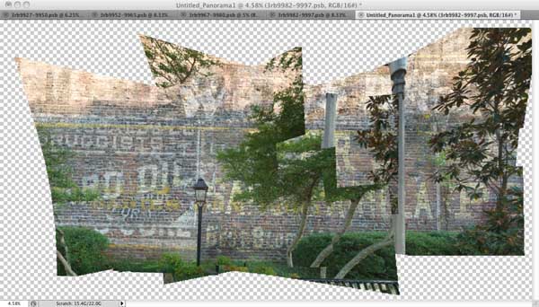
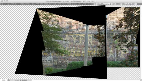
I then go through each layer and remove the black surround for each image. The reason I use black is because it can be selected without affecting the image content because there is rarely any pure 0 black in images.
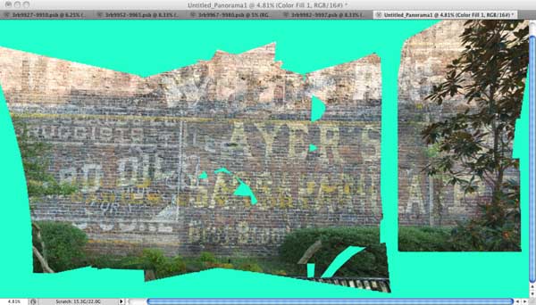
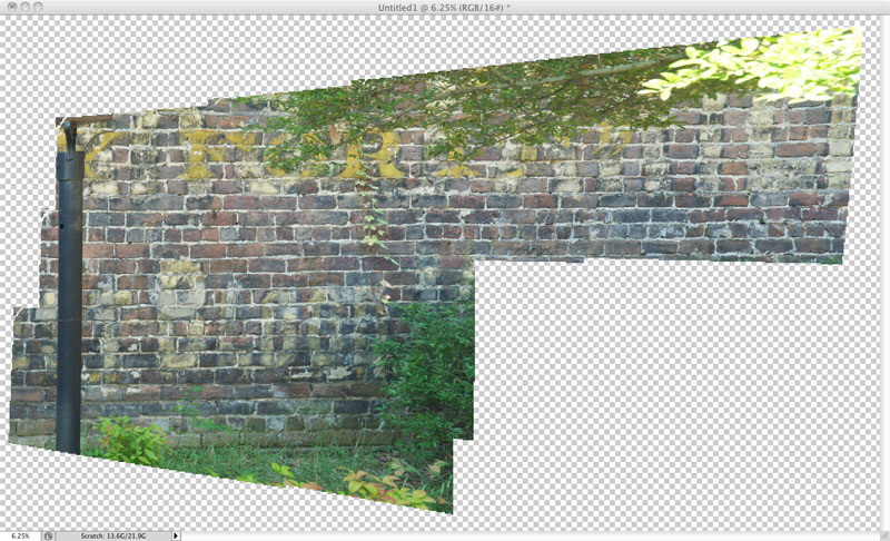
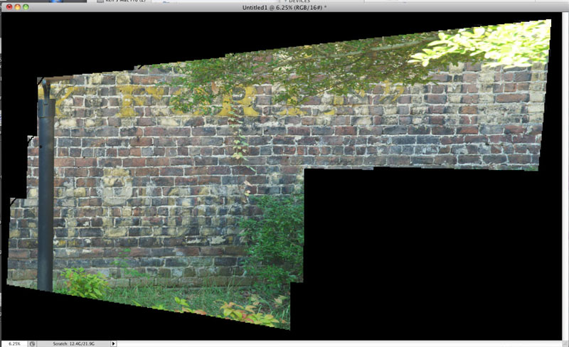
Since the images are aligned, it makes it straightforward to remove the trees and poles in each layer. I primarily use the polygonal select tool. As I cut away the foreground clutter from each image, a more complete sign is revealed. I found it helpful to place a bright color in the background to show the missing coverage.
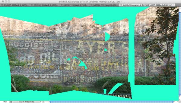
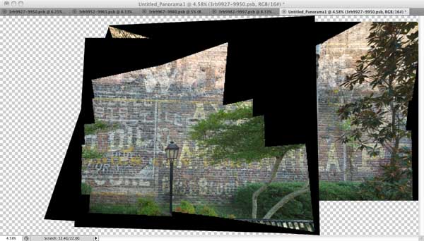
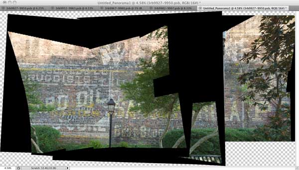
I then use the Auto-Blend option to blend all of the layers together. Sometimes I preceed this with another Auto-Align after I have removed the foreground clutter. In this case, I am still missing parts of the image. However, I have lots more photos to complete the coverage so I can concentrate on the just areas that are missing. As I continue the process.
Final Touches
The final step is the cleanup of the various clutter surrounding the sign. I also perform the perspective correction so the building is vertical and horizontal. I also fix some inconsistent perspective issues arising from the different camera positions. I add a sky and/or tree layer behind the building.
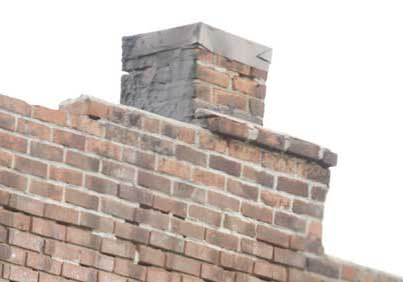
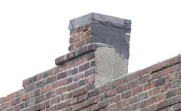
The intermediate mosaics of the sign include places where opposite sides of objects are visible such as the chimney. One the two pieces are rectified, I use the Photoshop erase tool to clean up the parts that are not shared.
The final image is 26899 by 13000 pixels, or around 350 megapixels. This image of the chimney is extracted from the final image to show the results of creating a matte edge around the bricks, and of rectifying the chimney and removed the sides.
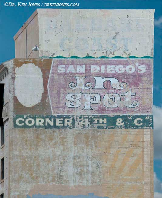
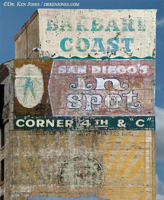
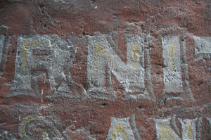
I preferentially color correct signs to reveal their now hidden message. The dancing girl in this sign in San Diego was not visible until I enhanced the blue. I couldn't even see it when I was photographing the sign.
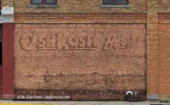
I am sometimes able to "remove" the red covering paint that was used to obliterate the old advertising. This example shows a particularly successful red paint result - "OshKosh B'gosh". I could not see the words when standing in front of the sign. I shoot signs like these hoping that some may actually reveal something interesting.
Summary
While the above is long and involved, there are lots of small steps required to make this all work. It is definitely true that the devil is in the details. The details of replacing the backgrounds are pretty standard Photoshop methods, so I won't describe them here.